Portfolio V2
Design, Code & Strategy
Sep 2026
I audited my own portfolio.
The numbers argued back.
The old portfolio photographed well but collapsed under real traffic. I treated myself as the client: same audit, same rigor, same receipts. No sentiment, no sacred cows.
The old portfolio photographed well but leaked visitors in analytics — 61% bounced before the second scroll.
"It was an art gallery, not a conversion engine."
Every decision traced back to 3 signals — behavior, intent, and funnel. If one signal disagreed, I investigated before touching pixels.
Measured, not promised. The first 30-day window opened September 2026 — before/after receipts publish when it closes.
The 3-Signal Rule
Every redesign I do — for myself or for clients — follows one rule: no design decision ships without three independent signals. One from behavior. One from intent. One from the funnel. If two signals disagree, I investigate before touching a pixel.
Behavior
What users actually do — recorded, not guessed.
Source: Clarity · Hotjar · Session Replays
Intent
What users are searching for — the demand behind the click.
Source: Search Console · Keyword Tools
Funnel
Where the model breaks — the drop-off that costs money.
Source: GA4 · Custom Events · A/B Tests
Why the rule exists
- One signal = anecdote. Two signals = hypothesis. Three signals = decision.
- Prevents taste-driven redesigns. If a change is based on "I like this," it fails the rule.
- Makes the case for clients. Every change traces back to a receipt, not a mood.
Why redesign at all?
Because a recording humbled me. Not a feeling — a recording.
"I watched a hiring manager from a Series B SaaS land on my homepage, scroll once, and leave. Eleven seconds, fully recorded. That replay was my kickoff meeting."
The Trigger · Clarity Session PlaybackOne replay is an anecdote. Three independent signals are a diagnosis. My own tracking stack handed me all three in the same week:
Intent died at the door
The biggest drop sat between the homepage and the case studies — visitors with intent never reached the proof.
Demand I wasn't answering
High impressions, low clicks on my strongest queries in Search Console. The titles promised less than the work actually delivered.
Dead clicks, repeated
Recordings showed the same nav element absorbing dead clicks for weeks. It looked interactive. It wasn't.
The Honest Audit (Before)
Baseline — 90 days pre-redesign. Source: my own GA4 + Clarity + Search Console.
"Recruiter scrolls past three project cards, hovers the nav, dead-clicks twice, leaves. No case study opened. No contact."
From gallery to playbook — a before/after that isn't afraid to be compared.
Same domain. Same owner. Same designer. Different question asked before the first pixel was placed.
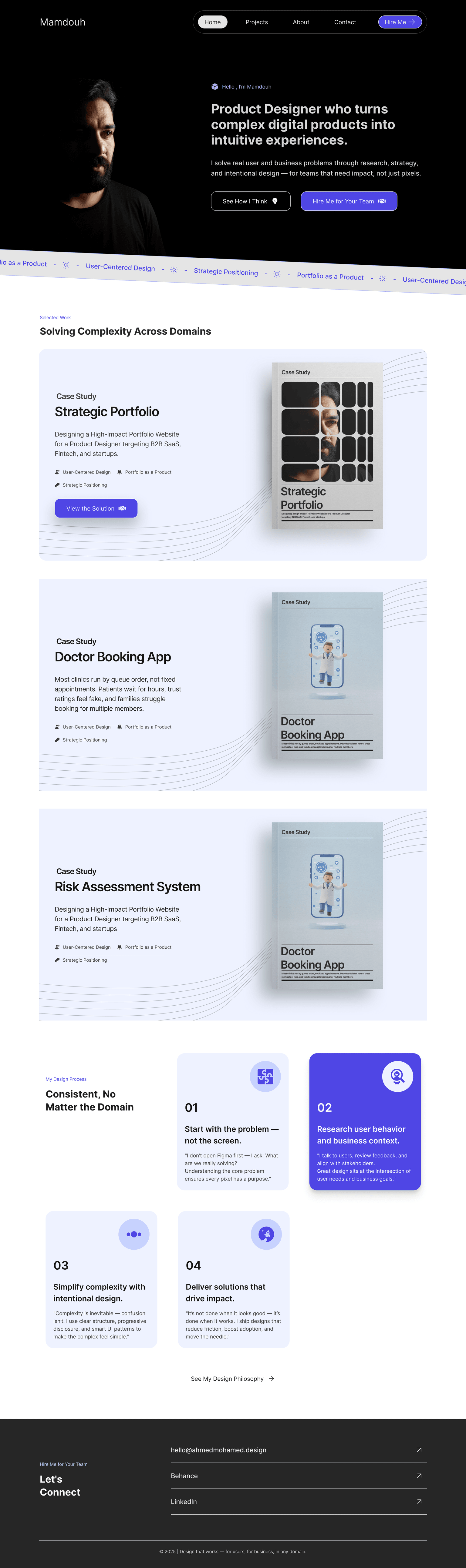
Heavy animation. A hero that said nothing. Three case studies nobody reached.
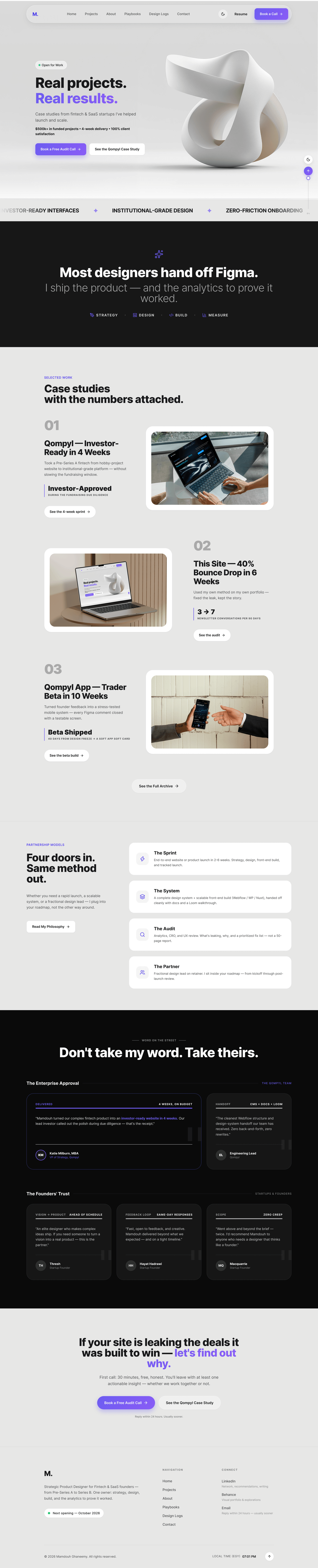
Metric-led hero. Proof above the fold. Case studies with numbers attached.
What stayed, what went
Every element had to defend itself with evidence — including the ones I loved.
| Element | Decision | The Evidence Behind It |
|---|---|---|
| Animated dark hero | Went | "Beauty that delays proof is a tax."61% bounced before the animation finished. |
| Long-form case studies | Stayed | "Fix the door, keep the room."44% scroll depth proved readers stayed when they arrived. |
| Purple accent system | Stayed | Strong brand recall in informal tests — refined for WCAG 2.2 AA contrast instead of replaced. |
| Sticky TOC | Stayed | Recordings showed readers losing their place mid-scroll. Anchors turned wandering into navigating. |
| Generic "Services" page | Went | Zero assisted conversions in 90 days. It explained nothing the case studies didn't prove better. |
| Insights / Blog series | Added | Search Console showed real query demand I had no page answering. Content became strategy, not decoration. |
| Proof-first hero copy | Added | The first screen now states the outcome and the method — the two things every recording showed visitors hunting for. |
Animated dark hero
Went"Beauty that delays proof is a tax."61% bounced before the animation finished.
Long-form case studies
Stayed"Fix the door, keep the room."44% scroll depth proved readers stayed when they arrived.
Purple accent system
StayedStrong brand recall in informal tests — refined for WCAG 2.2 AA contrast instead of replaced.
Sticky TOC
StayedRecordings showed readers losing their place mid-scroll. Anchors turned wandering into navigating.
Generic "Services" page
WentZero assisted conversions in 90 days. It explained nothing the case studies didn't prove better.
Insights / Blog series
AddedSearch Console showed real query demand I had no page answering. Content became strategy, not decoration.
Proof-first hero copy
AddedThe first screen now states the outcome and the method — the two things every recording showed visitors hunting for.
The first 30 days (After)
Same property, same events, same 30-day window before and after. That's the only fair comparison.
Before vs After
Conversations moved from 3 → 7 per 30 days. The direction is correct, but the sample is too small to call it a trend. I'm re-measuring at 90 days before publishing a ratio.
* Bounce = unengaged sessions (GA4) · Read depth = Clarity scroll maps · CTR = GSC top query.
The Uncomfortable Truths
A case study without confessions is an advertisement. Here are mine:
01 The auditor needed auditing.
I shipped v1 of this redesign with a broken anchor link. My own Clarity caught it in 48 hours. My rule saved me from my own mistake.
02 Mobile is still my weakest surface.
Conversion on mobile improved but remains significantly below desktop. The fix is designed, queued, but not shipped yet. Honesty over highlight reel.
03 Some of this may be seasonality.
Thirty days can flatter you. I'll re-measure at 90 days and publish the delta either way — up or down. That's the deal I make with my own numbers.
Your website could be proving more.
Same audit, same rigor, same receipts I just described — applied to you.
One owner, whole loop — audit to handoff.
Reply within 24 hours. Usually sooner.