Qompyl App
Product Designer — Mobile
Jun – Aug 2026
Trader Beta in
10 weeks. One design system. Zero dev rebuilds.
Turned fast-moving founder feedback into a state-driven mobile system — translating complex trading, monetization and compliance requirements into testable screens and documented components from kickoff through beta.
A feature-dense trading platform — including strategy building, token-based usage and compliance workflows — needed to become clear and usable on mobile while the product team continued iterating quickly across time zones.
Prototype-driven co-design. Product feedback was translated into testable screens and documented states, with monetization, compliance and edge cases treated as core UX rather than afterthoughts.
The beta design system supported Qompyl's August beta launch, with 30+ screens and 60+ documented states handed off through a reusable component system built to extend beyond the initial release.
The brief, the baseline
The one metric that mattered
Turn a feature-dense trading product into a mobile experience designed for clarity, confidence and beta readiness. Not perfect. Beta-ready.
States before pixels — because trust compounds when feedback is fast.
- • Complex builders on small screens
- • Token balances ambiguous before commit
- • Risk of misconfiguring a live strategy
- • Visible costs & states
- • Thumb-friendly flows
- • Confidence checks before running
Moving from paper trading to live execution introduces additional risk, security and compliance steps. The experience needed to make those requirements understandable without turning the transition into a legal maze.
The client
- The website strengthened Qompyl's external credibility. The app needed to carry that same level of clarity and polish into the product experience.
- Beta testers start mid-August — every screen must be dev-ready.
- Monetization and compliance live inside the UX, not outside it — treated as first-class product surface, not legal afterthought.
The challenge
"These may be hard to see and tap on mobile. I'd like to see a version of this that is split into two screens."
Core pain points
- 01Complexity vs. small screen — nested strategy conditions and multi-step flows squeezed into six inches.
- 02Monetization clarity — users needed to understand token balances and costs before reaching an insufficient-balance state.
- 03Compliance heaviness — legal documents required for live execution, on mobile.
The design opportunity
Mobile trading products often have to balance two competing pressures: simplifying complex workflows enough for a small screen without stripping away the information advanced users need. Qompyl's opportunity was to preserve product depth while making actions, states and consequences easier to understand at a glance.
That was the opening — state-driven clarity on a small screen.
The 10-week sprint
Five overlapping stages across approximately 10 weeks.
Feedback mining
Every founder note logged, sorted into 3 themes. Founder interviews transcribed. ~1 week.
Flows & wireframes
Low-fi and mid-fi for Settings, Strategy Builder, and Legal journeys. ~2 weeks.
High-fi + states
Dark-theme system; every component ships with empty/ready/insufficient states. ~3 weeks.
Prototype validation
Interactive HTML prototypes as the shared language. Comment → redesign → confirm loops. ~2 weeks.
Handoff & beta prep
Dev-ready specs, Portfolio screens, beta QA support. Ongoing.
Feedback mining, founder interviews, flows, wireframes.
High-fidelity system — Settings suite, Legal trio, state documentation.
Prototype loops — notifications, modals, editable conditions, token states.
Strategy Builder states + Portfolio screens kickoff for beta.
Three founder pushes that shaped the risk system
The client kept returning to the same theme — risk wasn't a setting to toggle, it was a conversation to design. Three of these pushes became the framework that shaped every trader-facing screen.
Risk as language
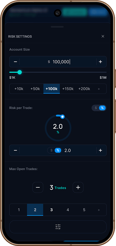
"The circle gauge should change colors based on risk setting. 0%–3% = blue, >3%–5% = amber, >5%–10% = red. If a user sets risk over 5%, show a warning."
Insight
Risk needs a visual vocabulary the trader reads at a glance — before committing, not after.
Action: color-coded risk gauge + inline warning at >5%, plus a custom numeric input — no modal.
Cost before failure
"Show the user's existing tokens. If they don't have enough, a 'Get Tokens' button that directs them to the store. Add both: ≈ 12 backtests OR ≈ 4 weeks of running a standard strategy."
Insight
Monetization friction lives at the decision point — not after the user clicks Run and hits a wall.
Action: token balance + shortfall warning + Get Tokens CTA inside the order box, with cost shown in both units.
Prevent, don't correct
"Can I see what a small warning indicator for incomplete tabs would look like? Like a caution symbol? We'll use these Success Screens at different areas — Setup Complete, Backtest Started, Strategy Deployed."
Insight
Catching incomplete setup only after "Run" creates unnecessary risk and friction.
Action: tab completion indicators + run-strategy guard + reusable success-state screens for every milestone.
A representative sample from the founder's Figma notes. Every comment showed product-level care — each one logged, answered, and closed. These three just make the pattern visible.
The strategy
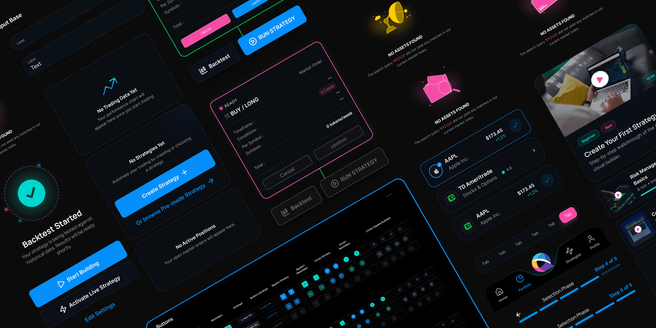
State-driven, thumb-first, compliance-aware — designed around how founders actually review work. Every component ships with three states documented before development starts.
.png&w=1280&q=85)
All conditions valid, balance sufficient. Run is unlocked.
.png&w=1280&q=85)
No conditions, no symbols. The screen teaches instead of blocking.
.png&w=1280&q=85)
Token shortfall is surfaced before Run — not after failure.
State-driven design
The order box ships in three states — empty, ready, insufficient. Nothing ambiguous reaches development.
Thumb ergonomics
Bottom sheets, segmented controls and clearly labeled actions reduce interaction complexity and keep key controls thumb-friendly.
Compliance as a journey
Risk disclosure becomes a guided acceptance flow — acknowledgment checkbox, gated CTA and always-available document access.
Why three states, not one
- Founders review testable prototypes — not static frames.
- Monetization sits at the decision point, never as a dark pattern.
- Every legal gate is friction-aware by design.
Built to scale
Not screens — a system the team can extend through beta and beyond, without me in the room.
Design tokens
Web → App colour, type, spacing. One brand across every surface.
Components
Modals, bottom sheets, PUSH/EMAIL chips — versioned, never rebuilt twice.
Testable prototypes
Interactive references developers can open — not guess from static frames.
Tracker
Every Figma comment logged, answered, and closed — tracked in a shared accountability board.
The tokens that outlived the screens
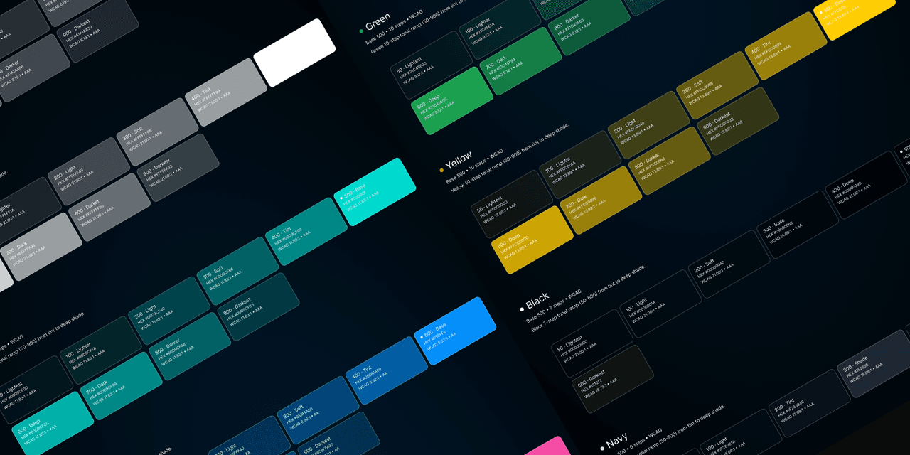
Not a Figma file. A three-layer token architecture that scales across Web and App. The reason no developer had to rebuild a single component at handoff.
Token architecture
- • 7 color families × 8 levels
- • Multi-mode (Light + Dark)
- • Alias-based (primitive → semantic → component)
Manrope · Inter
- • 12 font sizes (Title → Caption)
- • 9 weights available
- • Optimized for mobile readability
One system, 54 variants
- • 6 button styles × 3 sizes × 3 states
- • Every state documented (empty/ready/insufficient)
- • Dev-ready: zero rework on handoff
From flow sketch to beta-ready
A state-driven, dev-ready mobile system — built async, shipped on time.
Beyond the happy path
Edge StatesEvery failure, empty, and offline state — designed with the same care as the primary flow. Most portfolios skip these. The user doesn't.
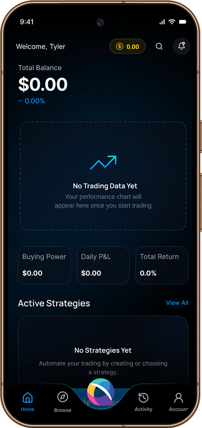
New trader lands on an empty portfolio. The screen teaches instead of blocking.
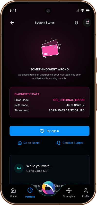
A 500 error with error code, reference, and timestamp.
Offline shows Wi-Fi, cellular, and last sync.
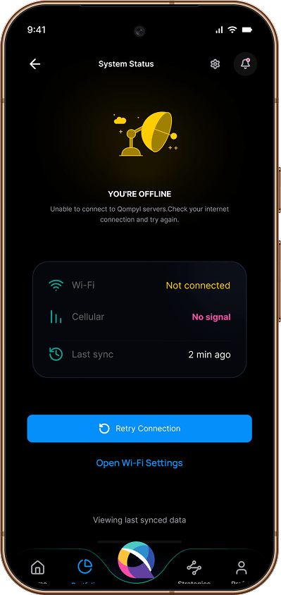
Three of 60+ states documented before development — empty, ready, insufficient, error, offline, loading, disabled, expired. Every one designed and documented before handoff.
Design system
FoundationThe visual language unifying the project — colour, type, components, accessibility.
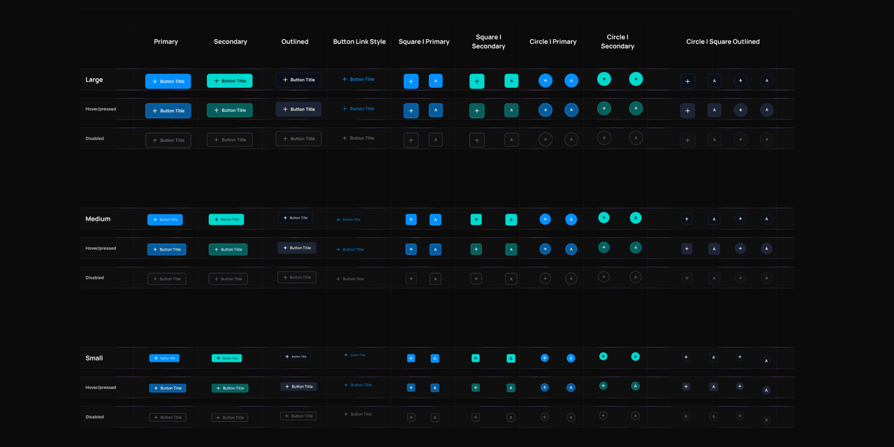
High-fidelity UI
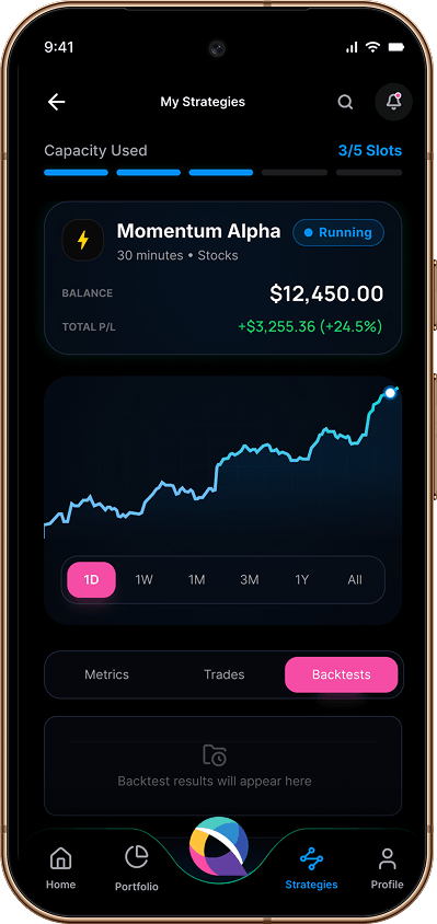
Final design30+ high-fidelity screens delivered to development through a consistent mobile design system.
Chart, P&L, and live strategies in one view.
Complex trading rules — built with drag, not code.
Expectancy, drawdown, and trending insights.
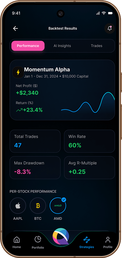
Three of 30+ screens — from the trader's dashboard to the decision-making layer.
Beta-readiness receipts
States before pixels — 60+ documented across the system, zero component redesigns after handoff. The system held.
The founder flagged in review that the editable parts of a strategy sentence read as labels — not controls. Blue chips looked static.
Impact & results
What actually shipped — three outcomes the founder cares about, not three process metrics.
"Your work has been excellent across the board. The state-by-state thinking on the order box — showing the token shortfall before it hits — saved us a support headache at beta. Looking forward to what's next."
What I'd do differently next time
A case study without confessions is an advertisement. Three things I'd change if I started this project tomorrow.
01 I over-designed the empty states first.
Spent 3 days perfecting "No strategies yet" screens before confirming the actual data flow. When founders changed the trigger logic, half the states had to be rebuilt. Next time: state map validated before any pixels drawn.
02 The token aliases came late.
Started with hardcoded colors. Migrated to aliases in week 6 — took 2 days to refactor 30+ screens. Should have started with tokens from day one.
03 I let the tablet question burn 4 hours in week 3.
Founders asked about iPad previews mid-sprint. We debated, sketched, killed the idea — four hours that should have been a five-minute decision at kickoff. Next time: scope boundaries locked before week 1 ends.
Reflection
"States before pixels — clarity compounds when feedback is fast."
What I learned
- Co-design with founders beats big-bang handoffs. Small loops build faster trust.
- Compliance is a feature — not a wall. Design it as a guided journey.
- A testable prototype ends debates that a static mockup can't.
Next steps
This isn't another trading app.
It's proof that complexity can feel simple — one state at a time.
One owner, whole loop — from whiteboard to beta.
Reply within 24 hours. Usually sooner.