Why Your SaaS Dashboard is Overwhelming: The "Decision Surface" Framework.
If your users ask "where do I start?" — you don't have a UX problem. You have a hierarchy problem. And it's causing Day-1 churn.

Users ignore 70% of widgets on the average overloaded dashboard.
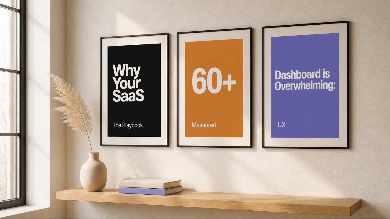
Visual Summary
A one-page visual recap of the entire framework. Click any card to jump to that section.
In the high-stakes environment of B2B SaaS, the dashboard is the product.
It is the first interface a user interacts with after onboarding, and the primary environment where they determine if your software actually delivers on its promised value. Yet, most dashboards fail this critical test. They are designed as data dumps rather than decision engines, resulting in cognitive overload, decision paralysis, and ultimately, user abandonment.
Clarity must precede complexity. This article deconstructs the anatomy of dashboard fatigue and provides a measurable, actionable framework to transform your interface from a chaotic report into a high-converting decision surface.
The 3 Culprits Behind Dashboard Fatigue
Short answer: SaaS dashboards overwhelm users because they prioritize data dumping over decision-making. When every metric has equal visual weight, users experience severe cognitive overload. This leads directly to decision paralysis and increased Day-1 churn.
Through extensive behavioral analysis using tools like Amplitude and Pendo, three recurring patterns consistently emerge:
The "Kitchen Sink" Syndrome
Stakeholders demand every possible metric be visible to justify their department. Result: analytics show users ignore 70% of widgets on a typical overloaded dashboard.
Equal Visual Weight
Same typography, color, and spacing applied to primary KPIs and secondary metadata. If every element is loud, the user tunes out entirely.
Missing Context
"42 Active Users" means nothing without context. Is 42 good? Bad? Up from last week? Static data without trends forces the user to do analytical heavy lifting.
The Decision Surface Framework (5 Layers)
Short answer: A dashboard is not a report; it is a decision surface. The 5-layer framework organizes data by urgency and actionability.
From Overwhelmed to Decision Surface
Explore the 5 Layers
Click any layer to see it in action
Single most important number. Largest size. Highest contrast.
Test Your Own Dashboard
Answer 5 questions. Get an instant verdict.
The ONE Metric Rule
Short answer: The ONE Metric Rule dictates that a dashboard should highlight a single, primary North Star metric above the fold. Supporting data should only appear to contextualize this primary metric.
Companies like Linear and Notion excel at this. When you open Linear, you see your immediate, actionable tasks — not a spreadsheet of every project ever created.
If you highlight three things, the user focuses on zero.
Progressive Disclosure in Action
Instead of displaying a 20-column data table on the main dashboard, show a summarized 3-column card view. Provide a clear, high-contrast "View Full Table" button.
Progressive Disclosure: Before vs After
Drag the slider ⇔- Accordion menus for secondary settings.
- Hover states that reveal additional data points.
- Modal windows so the user never loses their place.
The Proof: Qompyl App Case Study
Applying this framework to Qompyl's trading app resulted in 60+ documented states with zero component redesigns post-handoff.
Calculate Your Dashboard Churn Cost
See the real cost of a cluttered dashboard
Takes 5 minutes · No pitch · No strings
- Zero rebuilds. The design system held through beta.
- Faster iteration. The team extended the system themselves.
- Fewer decisions. Everything pre-solved in design.
- Beta-ready. Shipped with the product, not after.
→ Read the full Qompyl App Case Study to see the designs in action.
The Business Impact of Dashboard Clarity
| Impact Area | Result |
|---|---|
| Support Costs | Fewer navigation-related tickets |
| Time-to-Value | Accelerated "Aha!" moment |
| Day-1 Churn | Reduced early abandonment |
Baseline Metrics to Verify
Do not guess; measure. Before initiating a dashboard redesign, establish your baseline using tools like Amplitude or Pendo.
- Feature Adoption Rate: % of users who click the primary CTA within 5 minutes.
- Time to First Action: seconds between login and first meaningful click.
- Support Ticket Volume: categorize tickets related to navigation or confusion.
Was this article useful?
One click. No email required. Just helps me write better.
FAQ
SaaS dashboards overwhelm users primarily due to a lack of information hierarchy and the "stakeholder compromise" effect, where every feature request is added to the main screen without prioritization. When a dashboard attempts to serve every possible user persona simultaneously, it serves none of them effectively.
The ONE Metric Rule states that the primary view of any dashboard should highlight exactly one North Star metric above the fold. This metric must directly align with the user's primary goal for that specific session.
A highly effective dashboard typically surfaces 3 to 5 high-level metrics above the fold, with only one acting as the primary North Star. Use progressive disclosure for the rest.
Analyze behavioral data through Pendo or Amplitude. Look for UI elements with high visibility but near-zero interaction rates over 30-60 days. Cross-reference with support tickets. Hide behind "More" menu; if no complaints arise in 2 weeks, deprecate.
Speak business outcomes, not aesthetics. Frame around focus and conversion. Propose a short A/B test comparing cluttered vs. streamlined — let the improvement in Time-to-Value and retention speak.
Monthly receipts. No fluff.
One email per month. What I shipped, what I measured, what I'd do differently.
One email per month. Unsubscribe in one click.
Send me a screenshot of your dashboard
I'll record a free, 5-minute Loom video identifying 3 hierarchy fixes you can implement immediately.
screenshot/Share your primary dashboardloom/5-min Loom with 3 fixesno/No pitch, no strings