The "Make it Pop" Era is Dead: Why Founders Only Pay for Measurable UX.
In 2026, nobody funds a startup because their dashboard has a nice glassmorphism effect. They fund startups that retain users. Here is why measurable UX is the only design that matters.

Animated hero, zero proof above the fold.
Proof-first headline, static hero.
In 2026, nobody funds a SaaS startup because their dashboard has a nice glassmorphism effect. They fund startups that retain users.
Last month I watched a recording of a hiring manager land on a homepage — mine, actually. Eleven seconds: one scroll, two dead clicks on a nav element that looked interactive, then gone. The hero was beautiful. It was also the leak. That replay is why this article exists.
For years, the design industry sold founders a lie: Make it beautiful, and they will buy. We chased Dribbble likes, complex animations, and award-winning transitions. We called it "craft." But when the economic realities shifted and customer acquisition costs (CAC) skyrocketed, the hard truth emerged:
Beauty that delays proof is a tax.
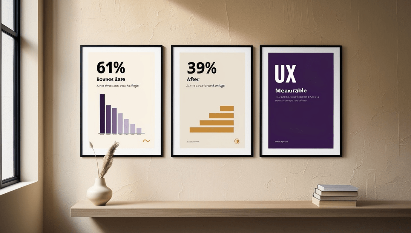
If your stunning, animated hero section causes a 61% bounce rate before the user even sees your core value proposition, your design isn't a masterpiece. It's a liability.
The Tax of "Beautiful" Design
Short answer: Beautiful design costs you conversion when it delays proof of value. Heavy animations add seconds to Time-to-Value, vague copy forces users to hunt for actions, and decorative UI competes with the signal instead of carrying it. The cost is measurable — usually in bounce rate and session duration.
I've seen it repeatedly in audits. A founder hires an agency to build a "world-class" B2B SaaS platform. The agency delivers 40 Figma screens that look like a sci-fi movie interface. But when it ships? Users can't figure out how to export a CSV. The heavy animations delay the "Time-to-Value" by crucial seconds. The vague, clever copywriting leaves users hunting for basic actions. (A composite — not any client of mine.)
Designers obsessed with aesthetics often build art galleries. But founders don't need art galleries; they need conversion engines.
The proof came from my own site. My old animated hero was gorgeous — and leaked 61% of visitors before the second scroll. When I killed the animation, replaced it with a proof-first headline, and shipped a tracked v1, the bounce dropped to 39% in the first 30 days. That single decision paid for the entire redesign.
The 3 Metrics Every SaaS Founder Actually Cares About
Short answer: The three metrics founders actually fund against are Time-to-Value (how fast a user feels the core benefit), Funnel Drop-off Rate (where they abandon), and Support Ticket Volume (how often the UI needs explaining). Everything else is diagnostic.
If you are a designer pitching a CTO or a founder, stop talking about Auto-Layout and start talking about these three:
01 Time-to-Value (TTV)
How many seconds (or clicks) does it take for a new user to experience the core benefit of your product? Good UX eliminates micro-friction in onboarding. Every unnecessary field in a signup form is a leak in your funnel.
02 Funnel Drop-off Rate
Where exactly are users abandoning the flow? Is it the pricing page? The KYC step in your FinTech app? Measurable UX doesn't guess; it looks at the drop-off data and redesigns that specific bottleneck.
03 Support Ticket Volume
"How do I do X?" is the most expensive question a startup can answer. If your customer success team spends a meaningful slice of their time explaining how to navigate the dashboard, your UI is paying for it monthly. Good design drastically reduces support overhead.
If you're not sure how to pull these numbers without exporting CSVs, the GA4 Data API for Designers shows the exact server route I use to fetch funnel data in 60 lines of code.
The "Measured Designer" Framework
Short answer: Measurable UX replaces opinions with receipts. The framework is three steps: start with session recordings, document a baseline before touching anything, and deliver state-driven designs — not happy-path mockups.
So how do we fix this? We stop guessing and start measuring. Here is the framework I use when auditing and redesigning SaaS platforms:
- 1
Recordings First, Opinions Last
I never start a redesign in Figma. I start in Microsoft Clarity or Hotjar. Watching a user "rage-click" on a dead element is worth 100 expert opinions. The eleven-second replay that started this article is a perfect example.
- 2
Define the Baseline
You cannot prove a redesign was successful if you don't know the starting numbers. Document the current bounce rate, CTR, and conversion rate before you open Figma. Without a baseline, the "after" is just an opinion.
- 3
State-Driven Deliverables
A developer cannot build a product from a "happy path" PNG. Measurable design means delivering the Empty states, Loading states, Error states, and Edge cases — the four states that actually define the user's real experience.
Does Aesthetics Still Matter?
Short answer: Aesthetics still matter — but its job has changed. In 2026, aesthetics builds trust, not delight. A clean, consistent UI signals competence and safety. Motion with a receipt is craft; motion without one is decoration.
Absolutely. But its role has changed.
In B2B SaaS and FinTech, aesthetics serve one primary function: Trust. A clean, professional, and consistent UI signals competence. It tells the user, "We are a serious institution; your data (and money) is safe with us."
Aesthetics without structure is just icing on an empty plate. Structure without aesthetics is edible, but hard to swallow. The sweet spot is a data-driven structure wrapped in a brand-consistent, trust-building aesthetic.
Stop buying pixels. Start buying conversion rates.
FAQ
Beautiful SaaS redesigns fail when they prioritize aesthetics over functionality. Heavy animations delay the Time-to-Value (TTV), and vague copywriting leaves users confused. If a design causes friction in the onboarding flow, it increases churn regardless of how good it looks. The fix is measurable: track bounce rate and scroll depth before and after, not just screenshot approval.
The three most critical UX metrics for SaaS are: <strong class='text-[color:var(--ink)]'>1) Time-to-Value</strong> (how fast a user experiences the core benefit), <strong class='text-[color:var(--ink)]'>2) Funnel Drop-off Rate</strong> (where users abandon the flow), and <strong class='text-[color:var(--ink)]'>3) Support Ticket Volume</strong> (how often users need help navigating the UI). Everything else is diagnostic.
Measurable UX is a design approach that relies on data rather than opinions. It involves setting baseline conversion metrics, using session recording tools like Microsoft Clarity, and delivering state-driven designs that solve specific business bottlenecks. The rule is simple: recordings first, opinions last.
Yes — but its job has changed. In B2B and FinTech, aesthetics builds <strong class='text-[color:var(--ink)]'>trust</strong> rather than delight. A clean, consistent UI signals competence and safety. Motion with a measurable receipt is craft; motion without one is decoration. The balance is a data-driven structure wrapped in a brand-consistent, trust-building aesthetic.
What to do next
If your current site is leaking the deals it was built to win, the same audit I applied to myself can be applied to yours — with your own numbers, your own recordings, your own receipts.
Monthly receipts. No fluff.
One email per month. What I shipped, what I measured, what I'd do differently.
One email per month. Unsubscribe in one click.
Is your website leaking the deals it was built to win?
Same audit, same rigor, same receipts I just described. First call: 30 minutes, free, honest — you'll leave with at least one actionable insight.
audit/UX & Analytics deep-divedesign/High-conversion UI systemhandoff/Dev-ready specs for any stack